Material UI
The System
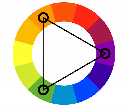
Triadic Color Wheel
A traditionally-balanced triadic color scheme focuses on one dominant color, with the other two evenly spaced colors both serving as accents.
Breakpoints
xs, extra-small: 0px
sm, small: 600px
md, medium: 900px
lg, large: 1200px
xl, extra-large: 1536px
CSS Baseline
<CssBaseline />
Global reset, a collection of HTML element and attribute style-normalizations. Removes margin: 8px on body.
styled-components
sx prop
Palette colors
The theme exposes the following palette colors (accessible under theme.palette.):
primary - used to represent primary interface elements for a user. It's the color displayed most frequently across your app's screens and components.
secondary - used to represent secondary interface elements for a user. It provides more ways to accent and distinguish your product. Having it is optional.
error - used to represent interface elements that the user should be made aware of.
warning - used to represent potentially dangerous actions or important messages.
info - used to present information to the user that is neutral and not necessarily important.
success - used to indicate the successful completion of an action that user triggered.
Custom Colors
Provide every color token (light, main, dark, and contrastText) when usingcustom colors for props in Material UI's components. Then you will be able to use it like this: <Button color="custom">
(For TypeScript, you need to add module augmentation for the custom value)